The full set of London borough green roof infographics are now available online. These complement the review of the London boroughs in the new green roof report 2019. This is, to our knowledge, the first time a whole city and its district have been mapped and analysed in detail.
Borough green roof infographics
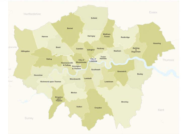
The infographics contain detailed information on the types of green roofs – whether extensive (including biosolar) or intensive – in each borough. They give a total area for each type of roof as well as an overall total for the entire borough. The information is supported by a map. In boroughs with a high density of green roofs (mainly the Inner London Boroughs, such as the City of Westminster), the location of the roofs is represented as a heat map.
In each borough, the percentage of roofs according size has been calculated. So, for example, in Islington roofs less than 100m2 constitute 15.5% of the total area of green roofs in the borough, while those larger than 1000m2 make up 6.5%.
Percentage increase of green roofs between 2016 and 2017
Each infographic also contains data on the increase between 2016 and 2017 in:
- area
- types
- size
Livingroofs.org will provide annual updates of the infographics in the future.
A springboard for further analysis
Whilst the new green roof report provides rigorous analysis of the data contained in the infographics, further research will be undertaken in the coming months. The results and discussions arising from this analysis will be published here. Sign up for the newsletter to keep up to date with this work.
This research supports the work of the boroughs and the London Government in greening the UK capital.